

Leave a comment on this post and on Tuesday, I will choose a random winner for a little goodie pack. Tell me which way you like this card, vertical or horizontal 🙂
 I used an image from the Sweet Summer stamp set that you can get for FREE with a $50 order? Did you notice the Scallop layer behind my main image?? I really wanted to back the 2 1/2" Circle Punch with something so I
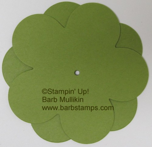
  started looking at my Big Shot dies. I chose to use my Island Floral Bigz Die. It has a large 5 petal flower and I found that if I stack two of them together, it makes the perfect scallop layer for the 2 1/2" Circle Punch!!!


Here is the vertical version. The Old Olive Strip is two of the bookmark die cuts from the Two Tags Bigz Die placed end to end under my main image. I also used a button from the Ice Cream Parlor Ribbon and Buttons pack which you could also choose for FREE with a $50 order.

Gosh, it looks good both ways. Im going to say vertical tho 🙂
I think horizontal – probably because most of my cards are horizontal. Love the use of the 5-petal flower to make your scallop circle!
I like both, but the horizontal one lets you put a sentiment on the front of the card. So horizontal is my favorite. Great use of the 5-petal flower.
My vote is for horizontal.
I vote horizontal, love the ribbon detail and that you added a sentiment.
Really versatile layout & I love the colors. I vote horizontal.The stamping remains the focal point while there is more versatility for sentiment location.
I like it both ways, however, I always have to have a sentiment on the front of my cards, so I would have to say horizontal is my favorite 🙂
Love the color combination! Both cards are great but my vote would be for the vertical as it’s a nice change. And sometimes you don’t want to add a sentiment on the front so this makes it ideal.
I am going with vertical. Another great way to use up that ribbon.
Both look good but I like the horiztonal better.
Both make for a great card but I like the flow of the card that is horizontal. Great idea of the use of the 5 petal flower behind the circle punch!
I find myself in a rut with vertical cards, but there are some card layouts that just “beg” to be horizontal — and I think this is one is “happy” as horizontal.
I like the horizontal but I’d nudge the whole thing to the center. It may already be in the middle and the way the card is pictured makes it looked off.
BTW — I really like your blog!
Susan
Hi, I like the horizontal style for this card. Don’t you just love the many ways one stamp can look so different. Thank you for sharing. I check your blog daily. Happiness, Carol G.
My vote is for “horizontal.” I love your color combination and your website. Thanks for all the time you put into it.
Blessings,
Beth B
I would say Horizontal. Thanks for sharing your talent with us. Blessings.
good morning from pennsylvania. i love the horizontal look. love the card: the colors are so vibrant.
thanks for sharing all of your ideas.
mary l from pa.
Funny, how different the card looks once you turn it. My vote is for the vertical one.
Both are awesome but I am a horizontal girl! Thanks for sharing both of your cards with us and for the chance to win a goodie pack! I’m sure whatever is in it will be fantastic!
I like the horizonal one better. Thanks for the chance to win.
Martha
when i saw the first card, i thought horizontal but then i saw the vertical one and i think it is my favorite!!!
What a tough call, since the card looks gorgeous both ways! I think I’m going to have to go with horizontal, though, because of the added sentiment.
Barb – you’ve hit the nail on the head, your card can be either horizontal or vertical. You’re not limiting the presentation; however, I prefer horizontal. Thanks for sharing your creativity.
I really like this card vertical. This way the sentiment goes on the inside. I like to make cards without words on the front, this way I can add them later when I need a get well or a thinking of you card.
Thanks for sharing your card. The colors are great.
Horizontal gets my vote; love the color combo! Thanks for sharing. MJ
I, too, like them both. But I will say I like the vertical one just a bit more. Cute color combo too.
Love them both but favor the vertical style!
I vote for the horizontal. It looks like it would be easier to include a sentiment. Love the colors and the pearls; they make the card really stand out. Andrea G.
It’s hard to choose. But my eye is drawn to the vertical layout. Love the color combos.
I like vertical best! Hard decision.